DEVELOP Typography – Analogue Experiments
Following my visual research I started to do some testing.
Firstly I tried using a dip pen and ink to give a ‘scratchy’ effect. I also tested these on damp paper.


The damp paper effect works really well I think. The dry paper looks ok, but isn’t anything special.
Next I used a calligraphy brush and ink. This looked great when bits of the brush separated, creating extra lines. I also like the variety of tones in each letterform.


At this point I thought it was worth trying to create a typeface out of some of these. I used Calligraphr for this.


I included some alternates too, because I thought this might help to make it feel more organic.

The pen and ink text looks ok, but the brush one is far too flat for my liking. The variation of tone is gone (which in hindsight I should have guessed would happen). I don’t think it’s worth using it for any outcomes, but it is helpful for working out layouts before I do the lettering by hand.
The other thing I tried was using rubber letter stamps, on wet, damp and dry paper.

There’s a good depth in some of these letters that fits well with some of my research. Might be good for incidental lettering.
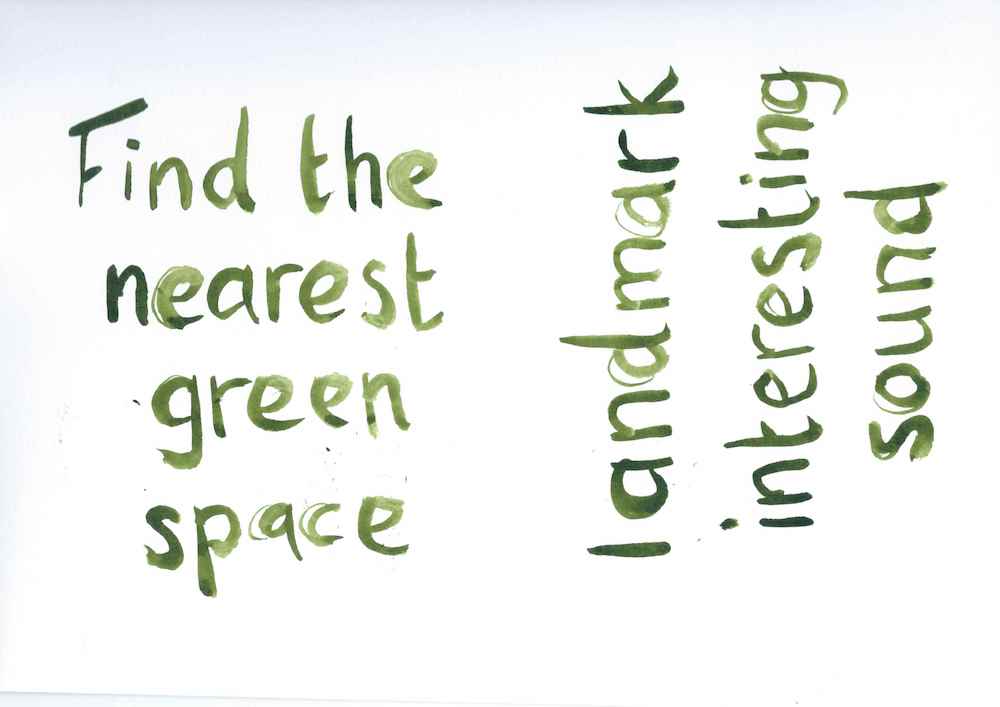
The other thing I tried was using paint pens. I did these on tracing paper so I could overlay them onto some textured backgrounds.


These were done with black, silver and green paint pens. The silver scans really badly, and didn’t have enough contrast. The black looked ok. The green works well I think – a nice consistency and contrast level. I’m not sure how I will use this but I’m keeping it in mind.